
Brand Identity & Logo System
✳︎
Key Visuals
✳︎
E-Commerce & Social Launch Collaterals
✳︎
Brand Identity & Logo System ✳︎ Key Visuals ✳︎ E-Commerce & Social Launch Collaterals ✳︎
the friction
Coffee is culturally
branded as a warm, slow morning ritual.
the norm
As a carbonated drink, COFFIZZ sat in a middle ground lacking the HIGH energy of a soda.
cause effect
failing to capture the YOUTH’S afternoon attention.
the goal
Pivot Coffizz a sleepy morning boost TO an energetic anytime refreshment.
the angle
Develop a visual system centered on Controlled Chaos.
the shift
giving the brand the vibrant, erratic spirit of youth culture.
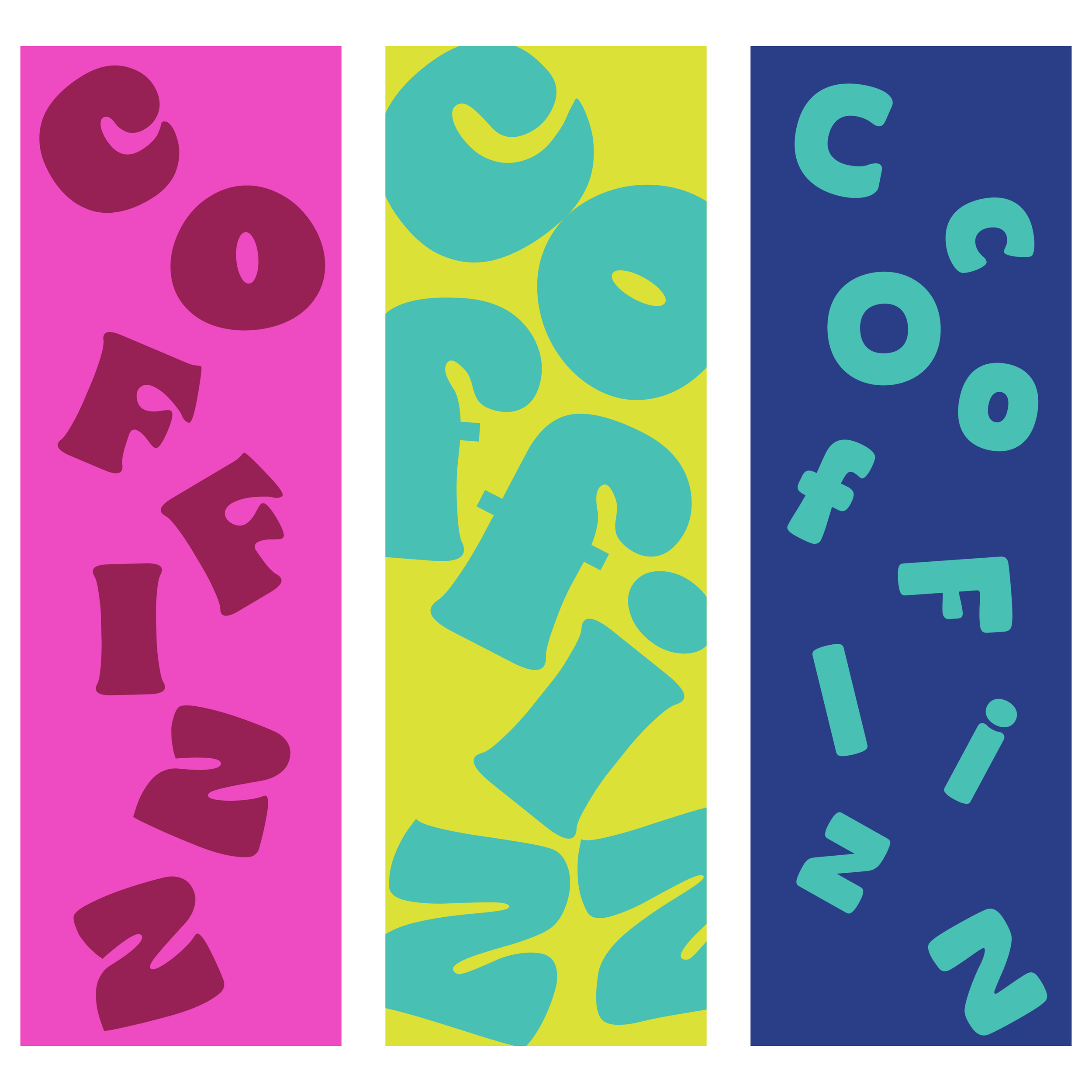
building the world
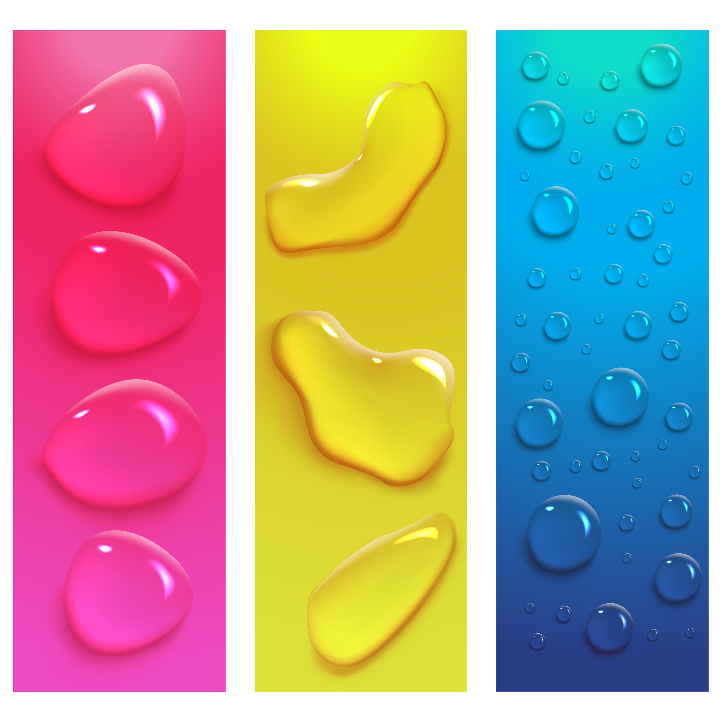
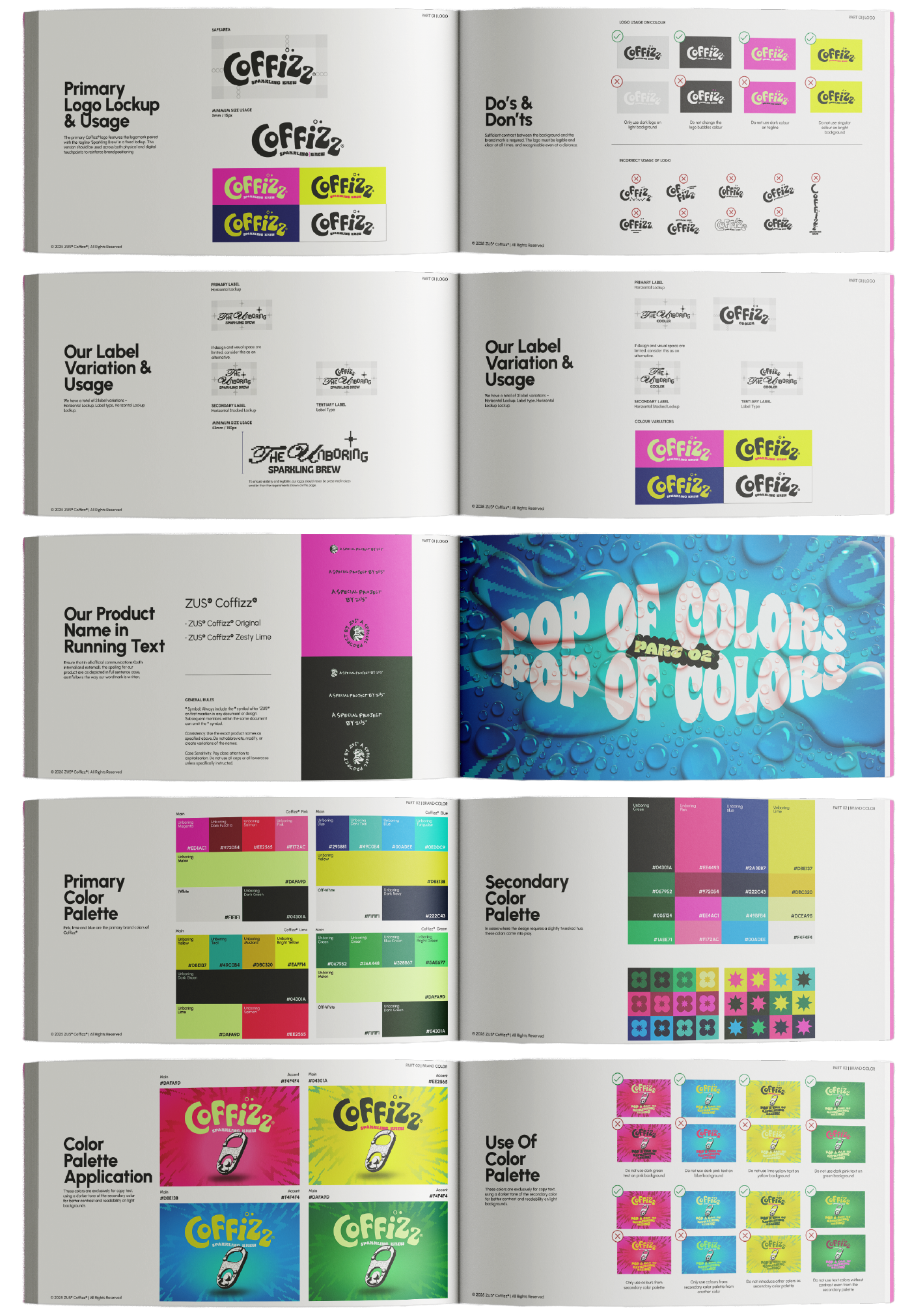
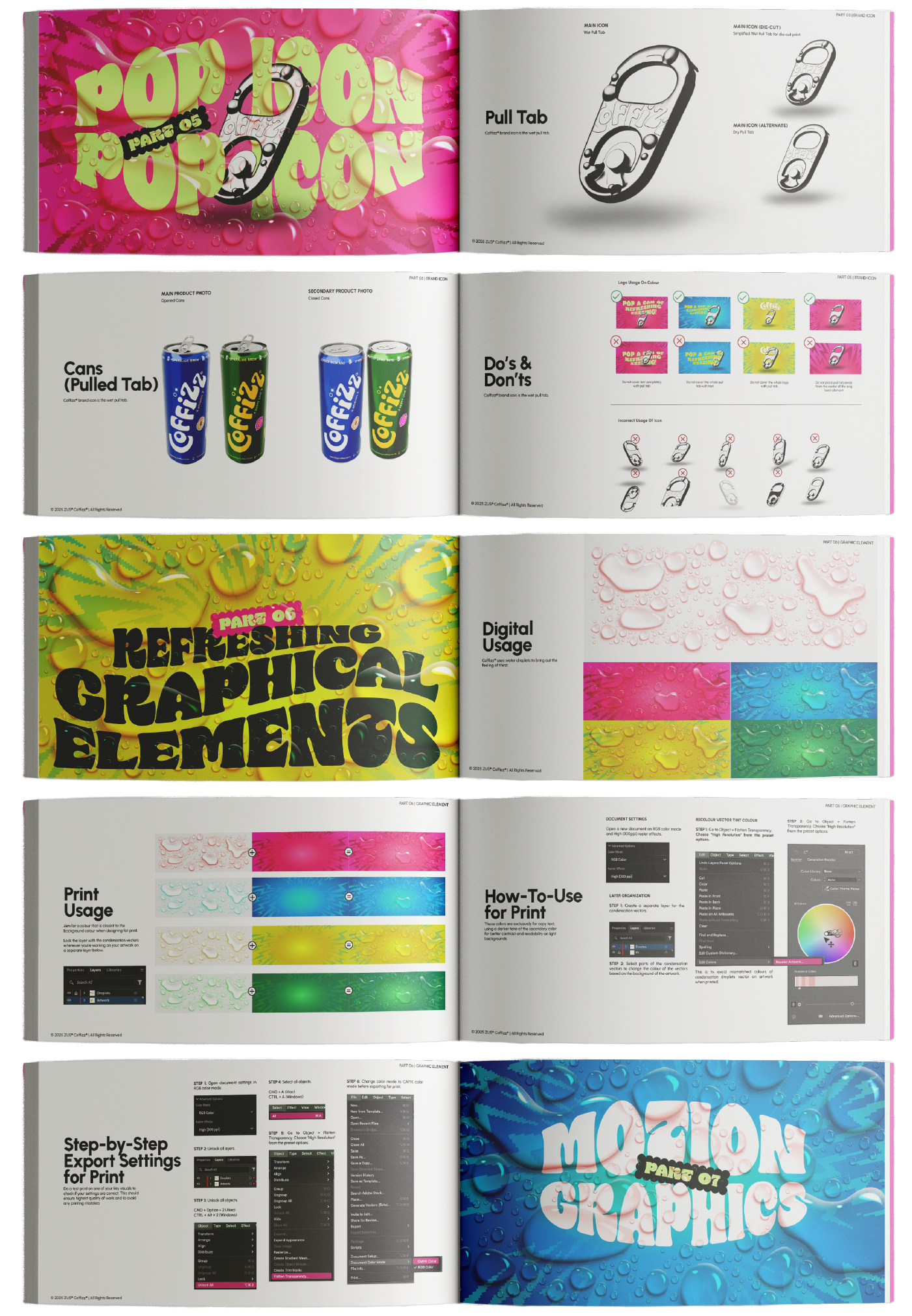
REFRESHMENT SENSORY: 3D water droplets enhance the feeling of refreshment and sensory appeal.
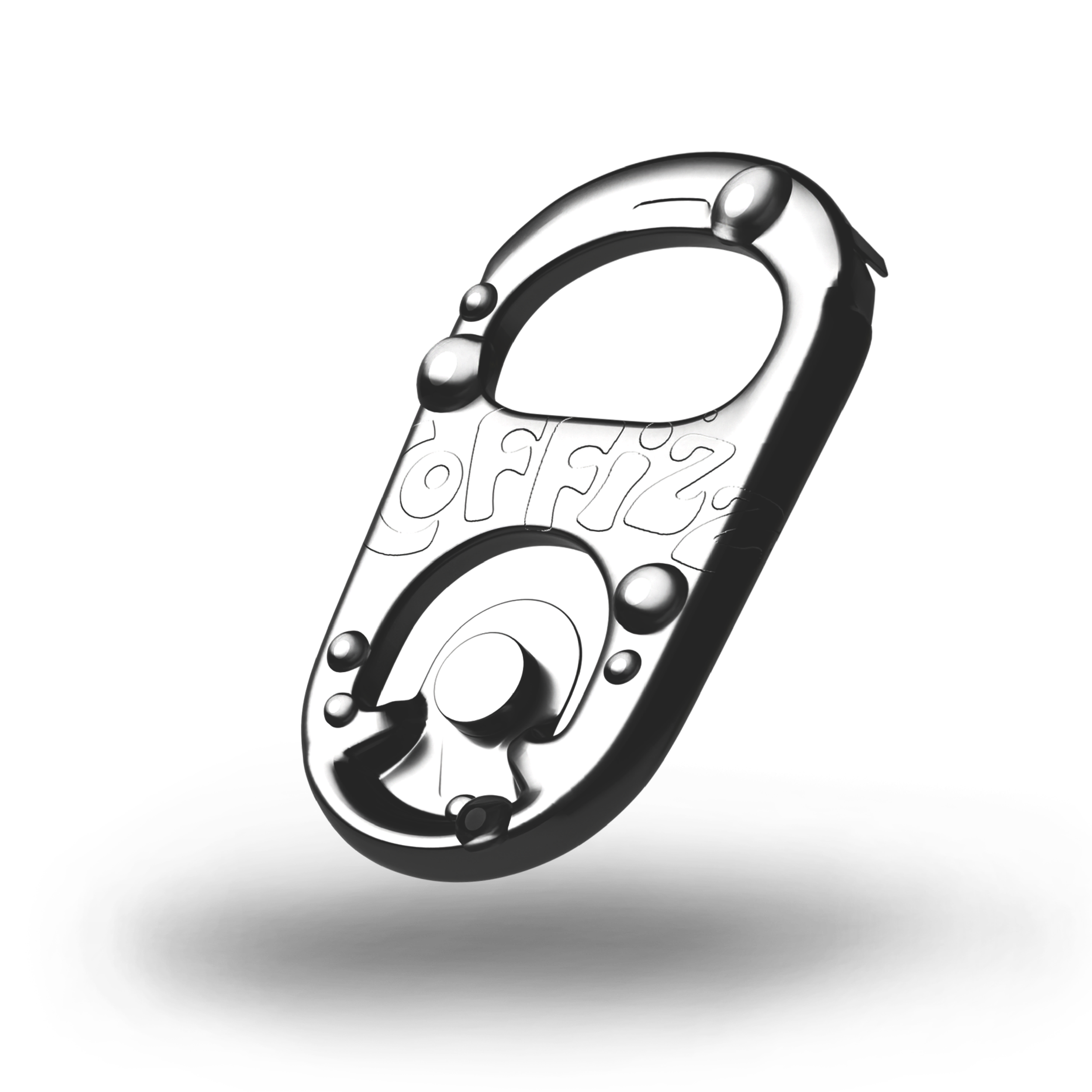
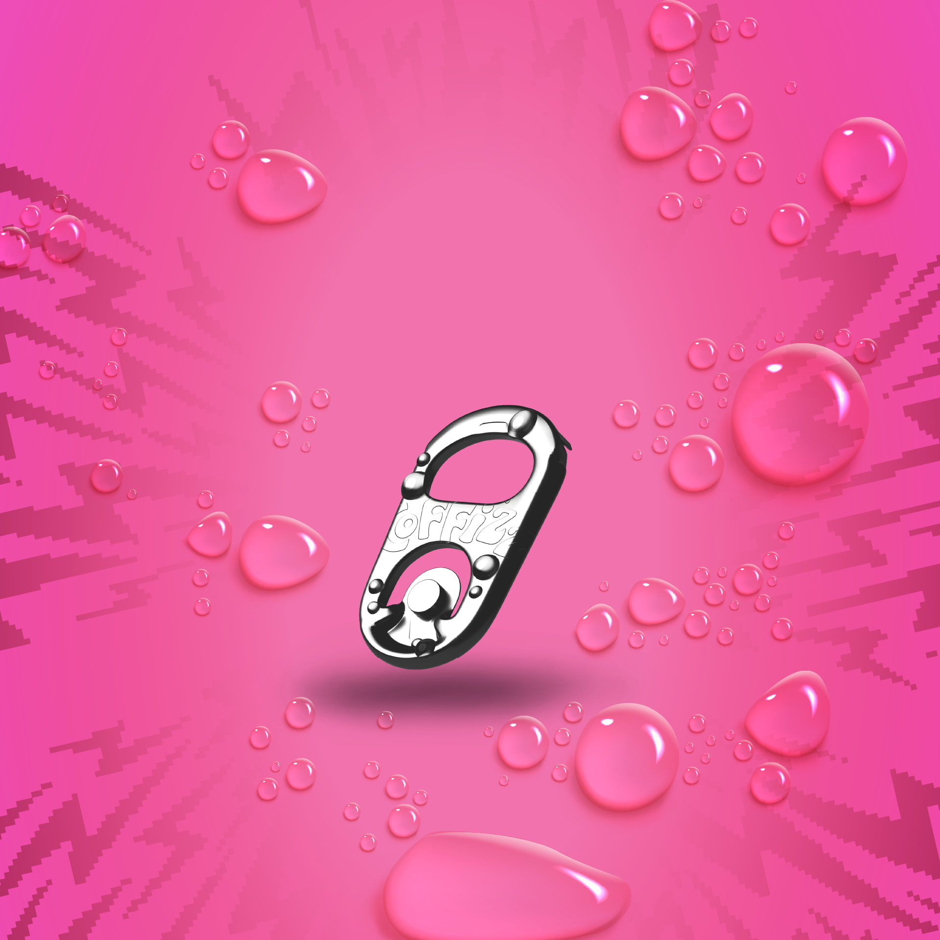
PULL TAB ICON: A signature icon inspired by the can itself, a visual cue for Pop a can of refreshing zing!
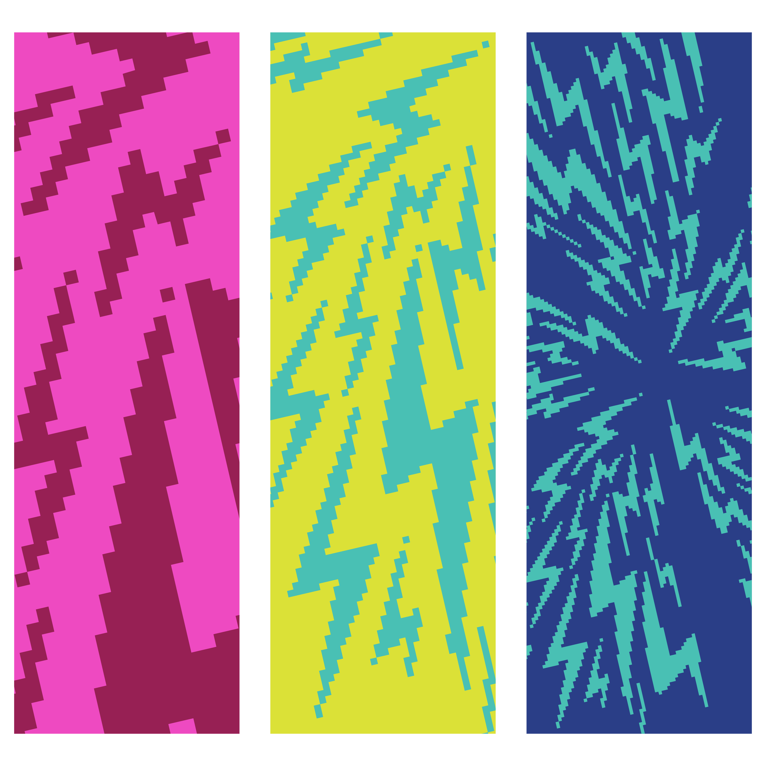
BITMAP FIZZ: Elements echo the carbonation in every drink, adding texture, movement, and personality.

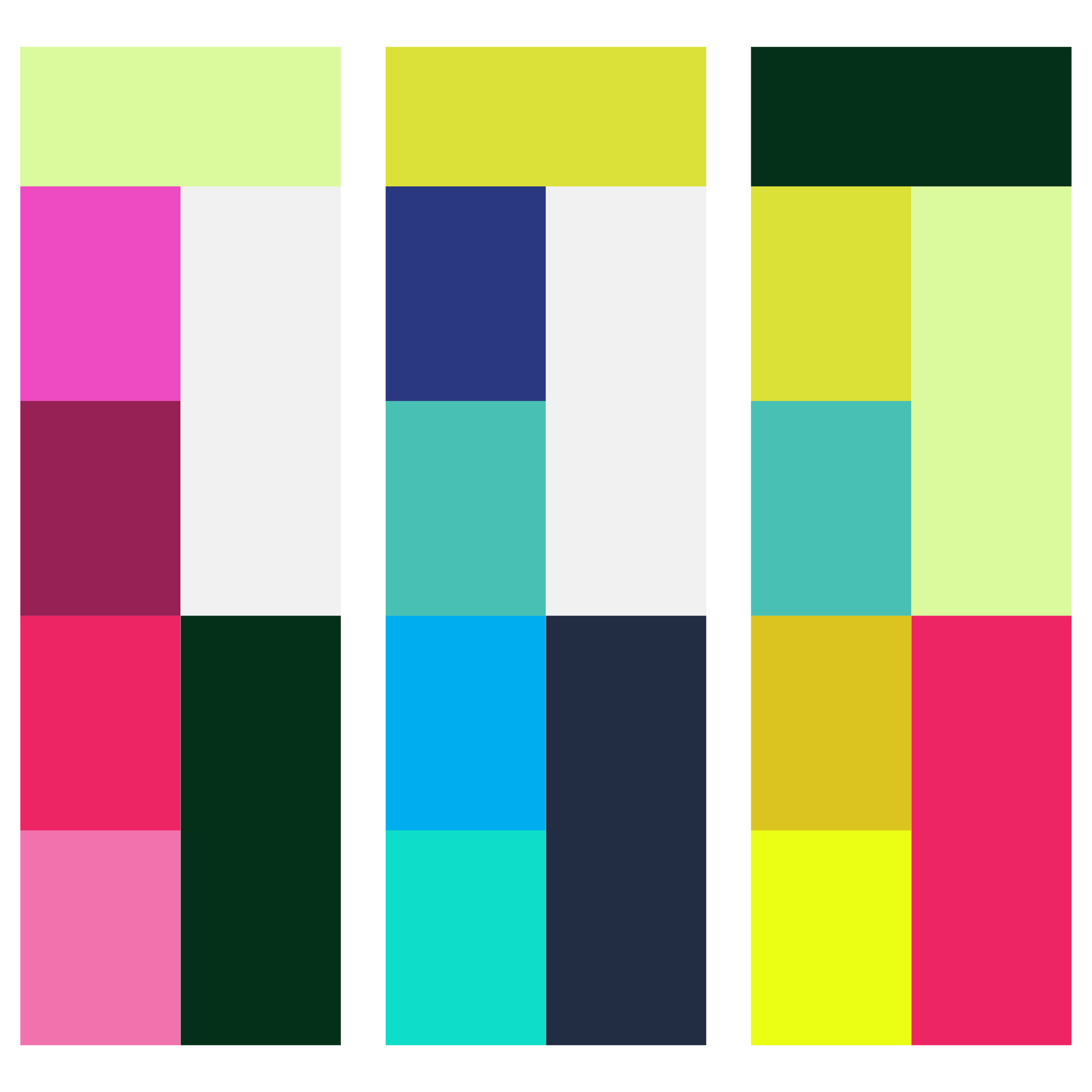
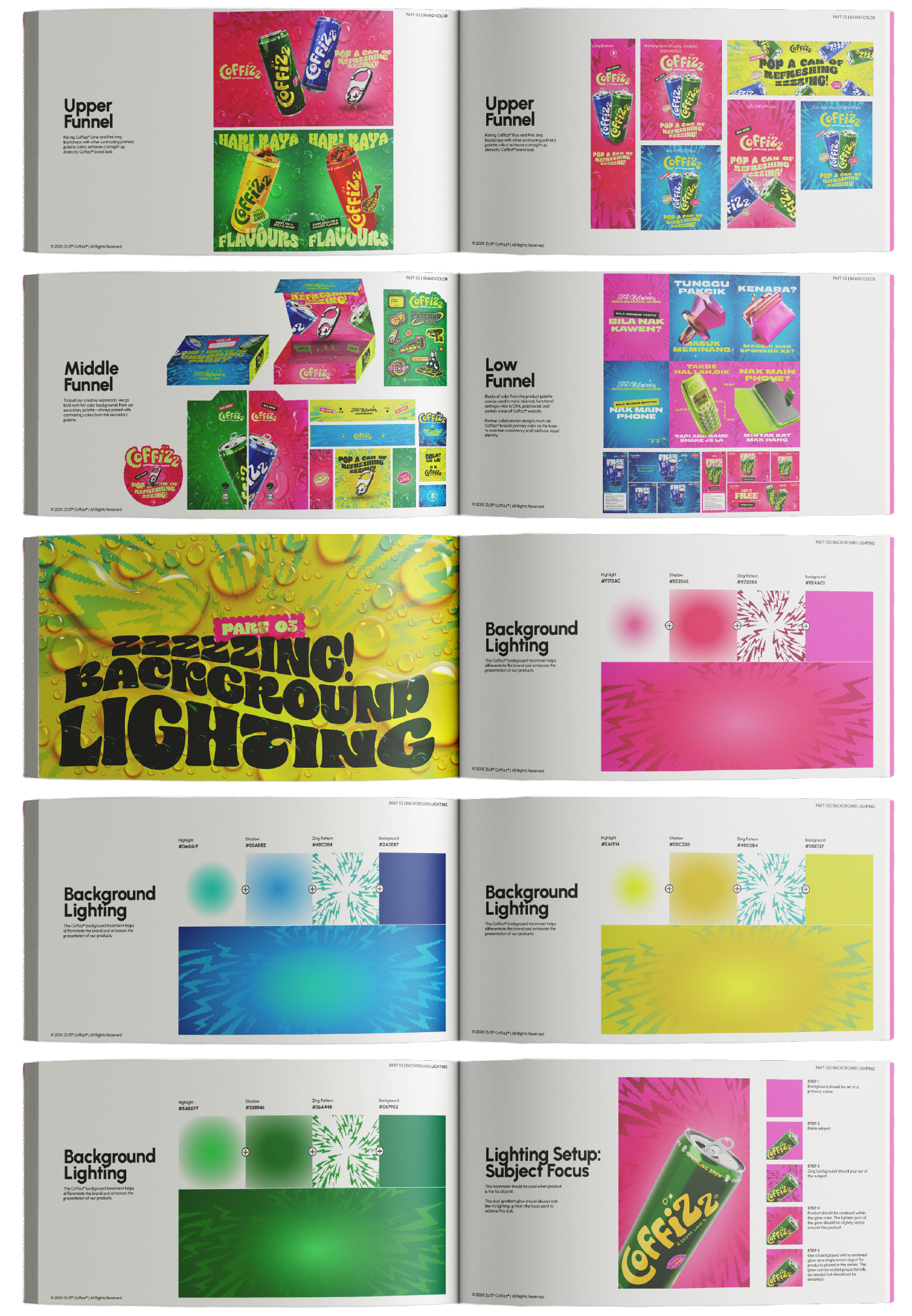
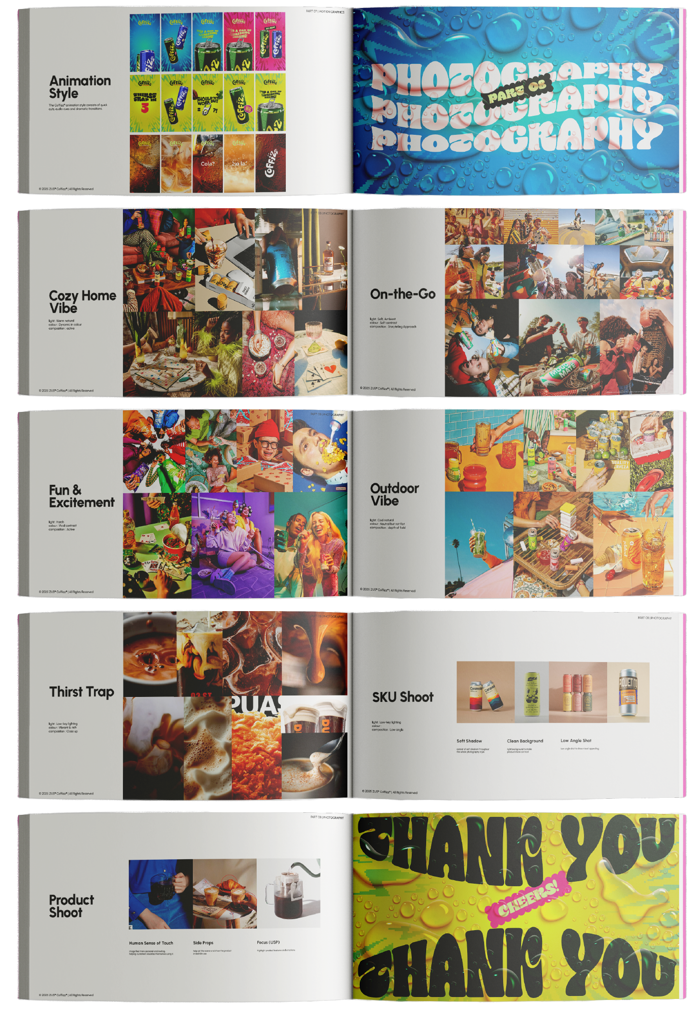
COLOUR AS ENERGY: Vibrant, high-contrast colourways designed to amplify energy and complement each product flavour.
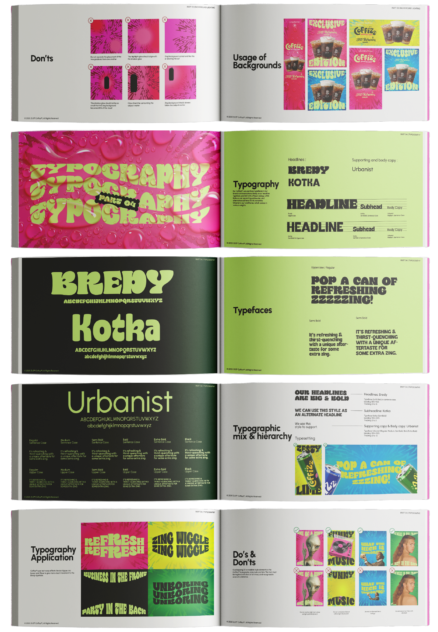
BOLD PLAYFUL TYPE: Fun, bold typography that reflects COFFIZZ’s playful personality and soft drink positioning.
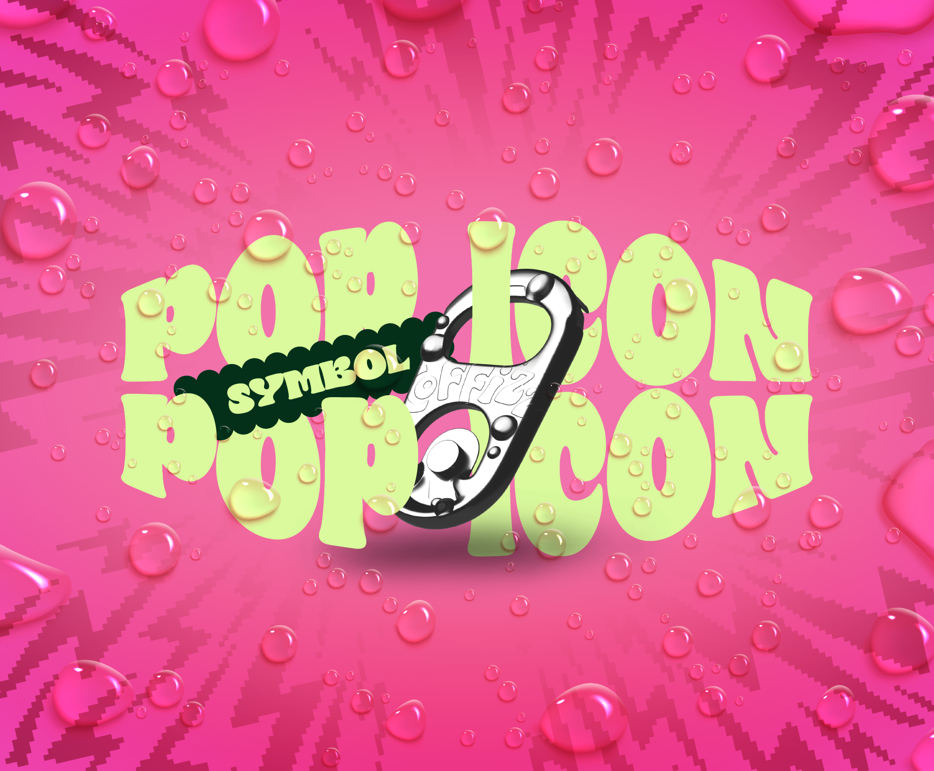
sMALL SYMBOL,
BIG ENERGY.
Art-directed the creation of a signature 3D brand icon engineered around our core campaign slogan, "Pop a can of refreshing zing!" Collaborating closely with our 3D artist, I conceptualized a custom soda ring-pull icon embossed with the brand logomark and enveloped in tactile 3D condensation and water droplets. This fresh, wet look establishes an instantly recognizable visual anchor by signaling ice-cold carbonation while setting the foundational visual tone for all future brand collateral.
By combining high-gloss liquid textures, hyper-realistic condensation drops, and vibrant kinetic typography, the icon translates a simple packaging gesture into a high-energy brand symbol. It serves as a versatile key visual asset across motion teasers, digital display ads, social campaigns, and e-commerce touchpoints to instantly trigger appetite appeal.
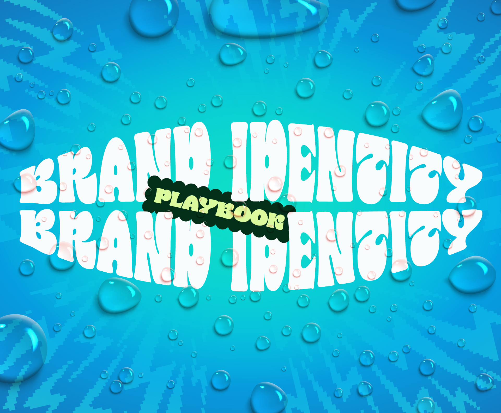
DESIGNED TO SCALE.
go big or go home.
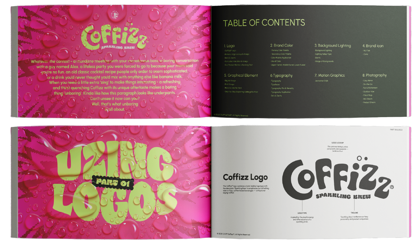
Developed a comprehensive visual identity system and design playbook tailored specifically to match the brand's bold, expressive personality. Anchored by custom display typography with fluid, undulating letterforms and a vibrant high-saturation color palette, the visual language captures the lively, carbonated essence of the beverage. Every foundational element, from graphic overlays to layout hierarchy, was crafted to establish a distinct, youthful attitude that sets Coffizz apart in the ready-to-drink space.
Built with modularity in mind, the identity framework translates effortlessly across physical, digital, and environmental touchpoints. The design playbook outlines flexible guidelines for packaging layouts, digital campaign assets, out-of-home displays, and retail merchandising while ensuring the brand's core DNA remains unified and instantly recognizable as the product line scales into future flavor extensions.
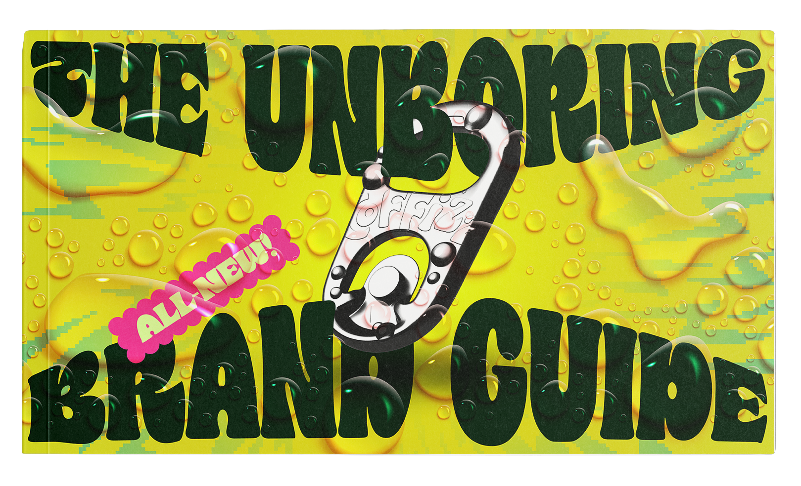
THE experience OF
UNBOXING THE FUN.
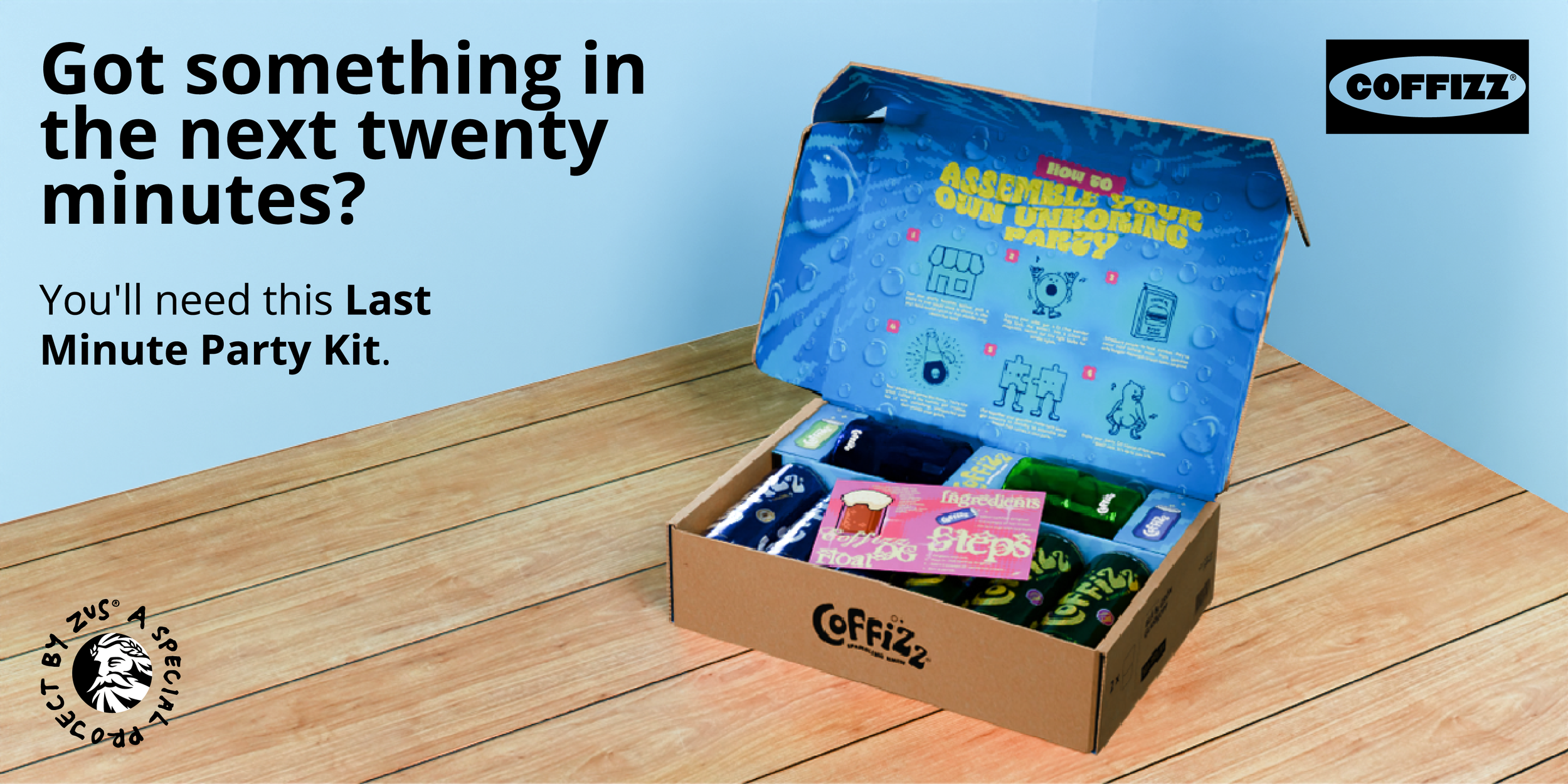
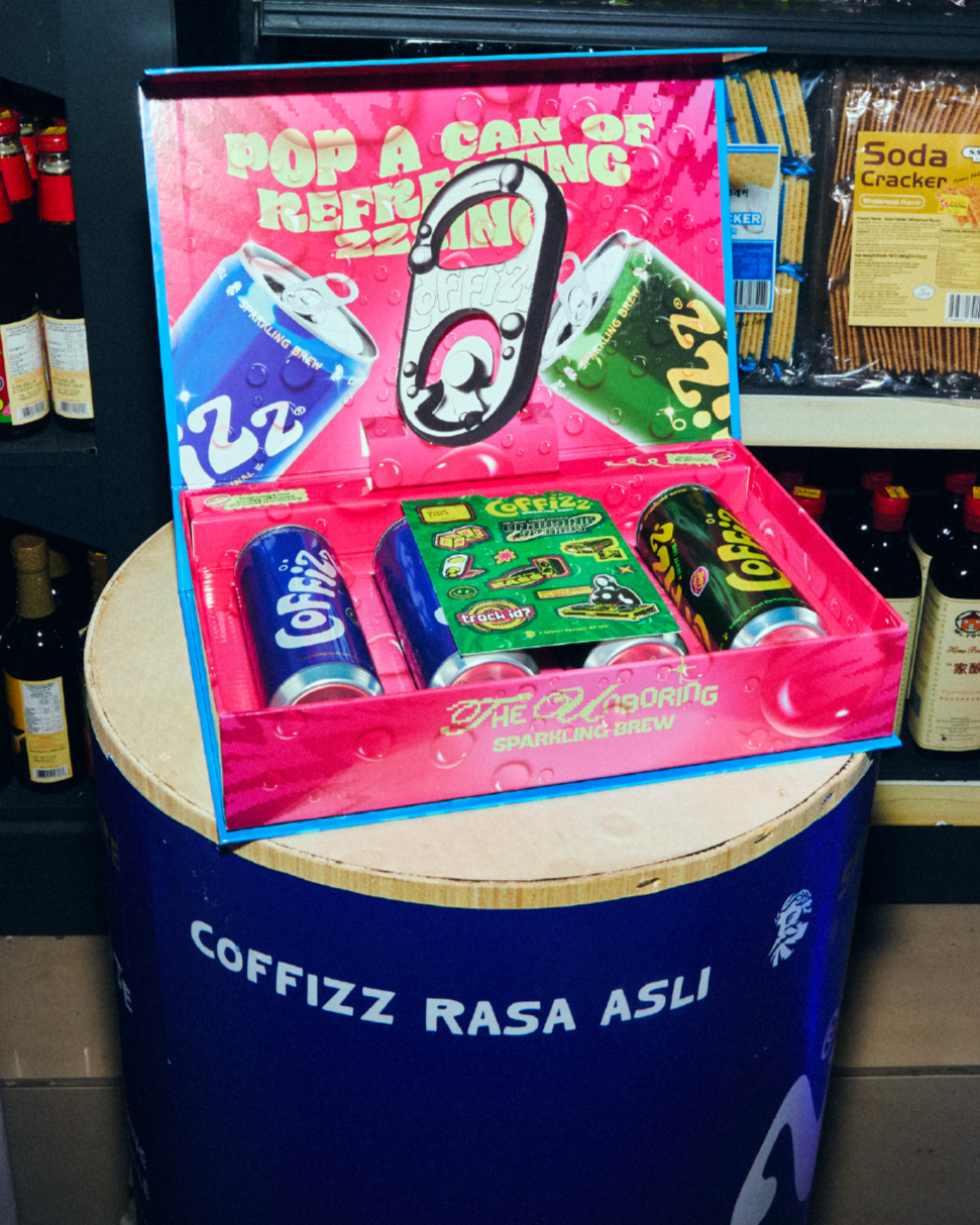
Conceptualized a dual-tiered PR unboxing experience built around visual subversion and strategic surprise. The exterior packaging utilizes a clean, utilitarian flat-pack style reminiscent of minimalist furniture design, setting up a subdued initial impression. Upon opening, the structural interior releases an explosion of fun, bursting with vibrant color panels, energetic graphics, and curated party essentials that turn a standard delivery into a high-impact sensory reveal.
Engineered across two distinct box sizes for targeted media and creator seeding, the packaging structures feature custom die-cut tray inserts that secure the product while framing the contents for immediate social sharing. By contrasting understated exterior casing with a high-octane interior reveal, the PR kits were designed to spark instant delight and maximize organic unboxing content across social channels.
UNMIXSTABLY UNEXPECTED BY DESIGN
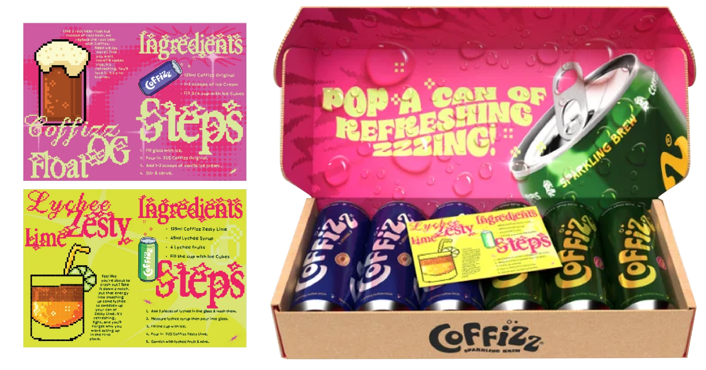
Designed as an interactive DIY kit, the internal packaging transforms Coffizz from a standalone RTD beverage into a versatile drink mixer. Nestled alongside the product cans are bespoke recipe cards, featuring custom retro-pop typography and pixel-art illustrations for signature concoctions like the Coffizz Float OG and Lychee Lime Zesty. The step-by-step guides invite recipients to experiment, mix, and create their own sparkling coffee mocktails at home.
By embedding a hands-on mixology element directly inside the box, the unboxing experience extends beyond passive consumption. The visual hierarchy of the recipe cards uses high-contrast color paneling and clear ingredient breakdowns, making the mixology process approachable while creating shareable, story-worthy moments for creators and fans alike.
NOT LIKE ANY OTHER UNBORING PARTY.
Executing the high-level launch strategy framed by our creative director and creative strategist, spearheaded the spatial art direction and visual execution for the live launch party hosted inside an authentic kedai runcit (traditional local sundry shop). Tasked with bringing the campaign to life on-site, translated the overarching strategy into a cohesive physical experience by transforming the raw, rustic charm of the heritage venue into a vibrant, high-energy brand environment.
Led end-to-end environmental styling across the space, designing custom branded interventions, retro retail signage, and tactile display setups that integrated Coffizz naturally into the shop’s existing architecture. By balancing nostalgic local culture with bold, contemporary brand assets, the art direction delivered an immersive, highly photogenic atmosphere that maximized content creation for press, creators, and attendees.
THE event, PACKED
& READY TO DRINK
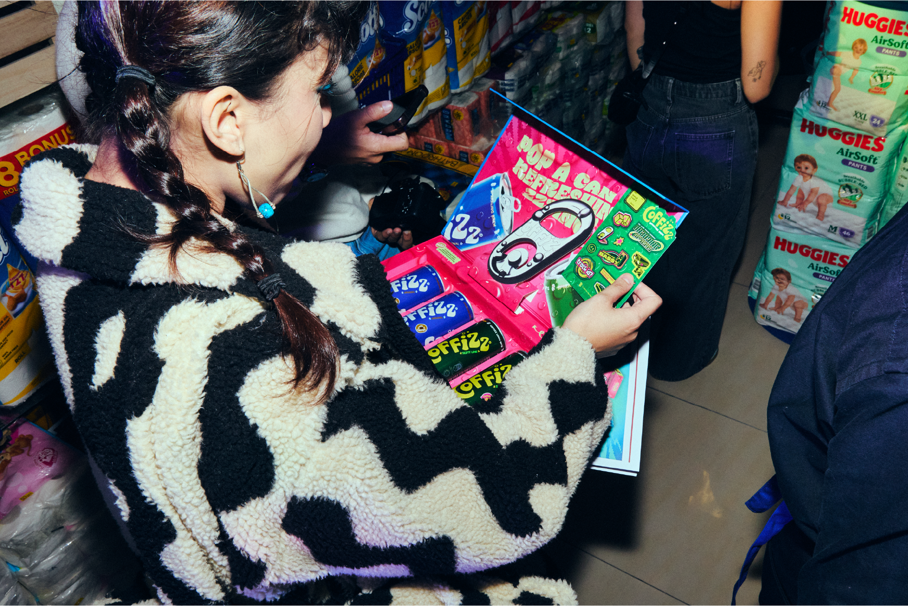
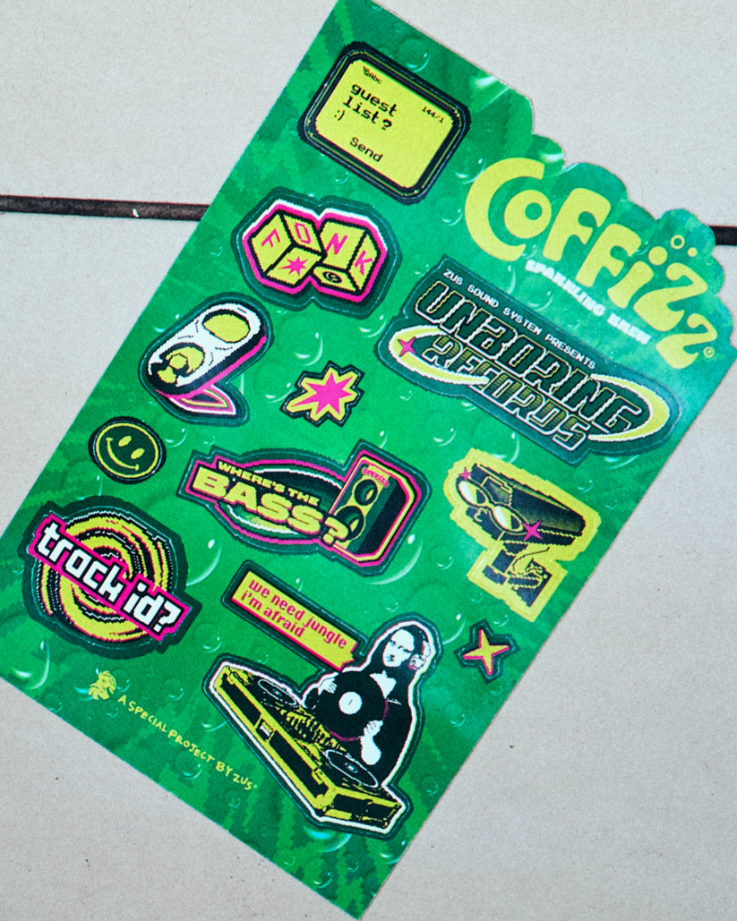
Distributed exclusively at the official Coffizz launch event, this event kit was designed to capture the high-energy atmosphere of the night. Anchored by club culture iconography and street-style graphics, the package includes an exclusive launch sticker pack featuring playful typographic badges like "track id?", "where's the bass?", and a DJing Mona Lisa, directly connecting the brand to music, nightlife, and youth subculture.
Beyond serving as event takeaways, the custom sticker set and branded merch elements were crafted as collectible accessories. Guests could personalize their laptops, drinkware, and personal gear with the decals, turning event attendees into organic brand ambassadors long after the launch party concluded.
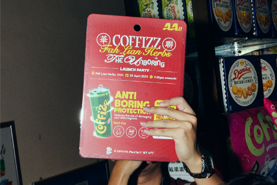
POWERING THE unboring INVITE.
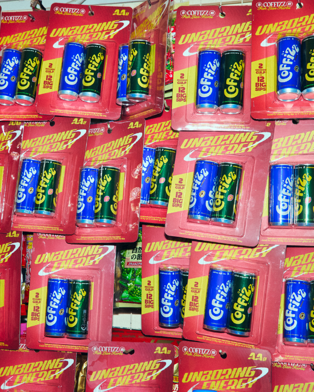
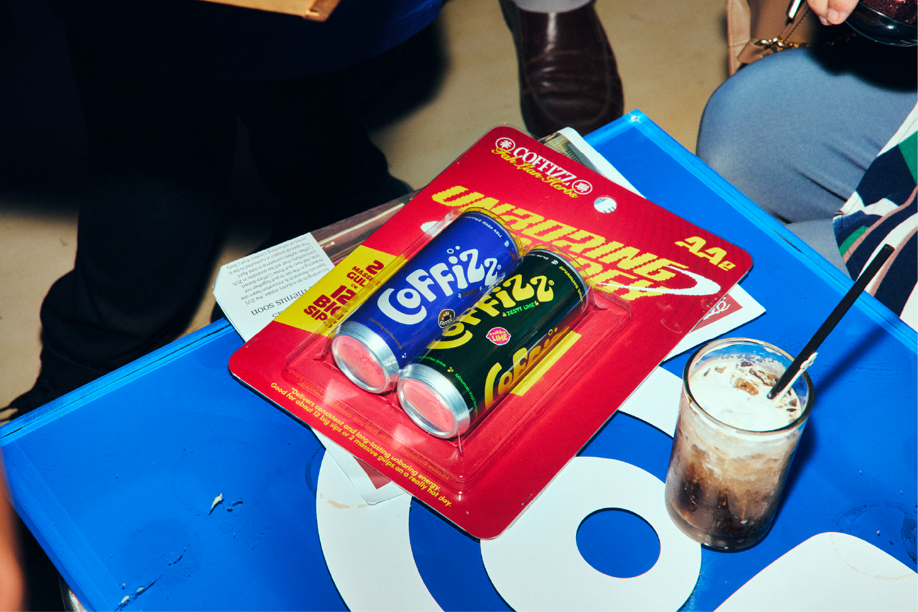
Reimagined the event invitation as a custom battery blister pack, metaphorically ‘powering’ the launch party. Modeled after classic retail AA battery packaging, the clear thermoformed blister houses both product cans under the headline "Unboring Energy". This tactile, industrial-pop concept turned a standard event invite into an intriguing physical item that instantly sets an energetic tone for the upcoming launch.
Engineered with longevity in mind, special focus was placed on material specification and structural rigidity. A high-gsm, heavy-duty paperboard backing was selected to ensure the card remains stiff and upright without bowing under the weight of the blister casing. This durable construction allows the invitation to transcend disposable event print, doubling as a standalone pop-art display piece that guests can take home and collect.
SAME OLD NEWS,
FRESH NEW ENERGY.
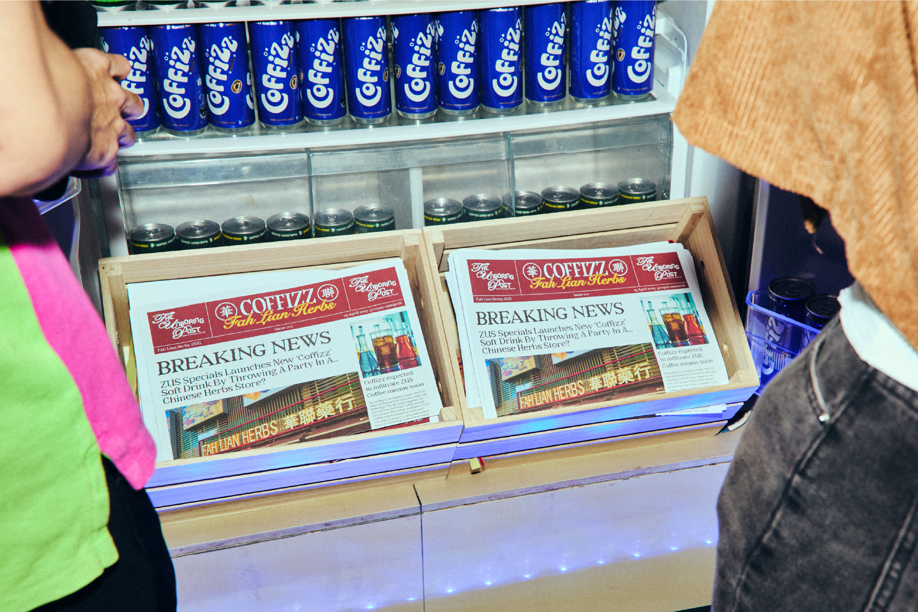
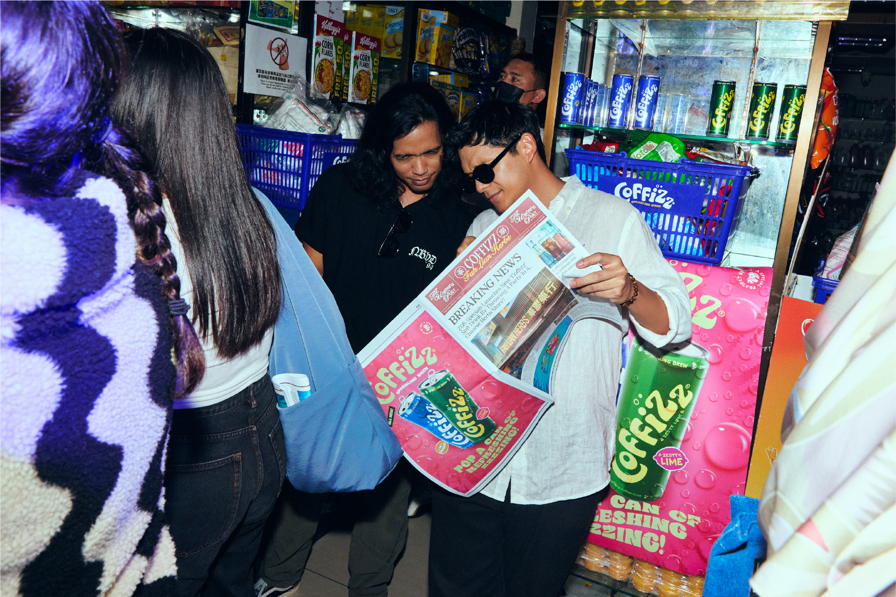
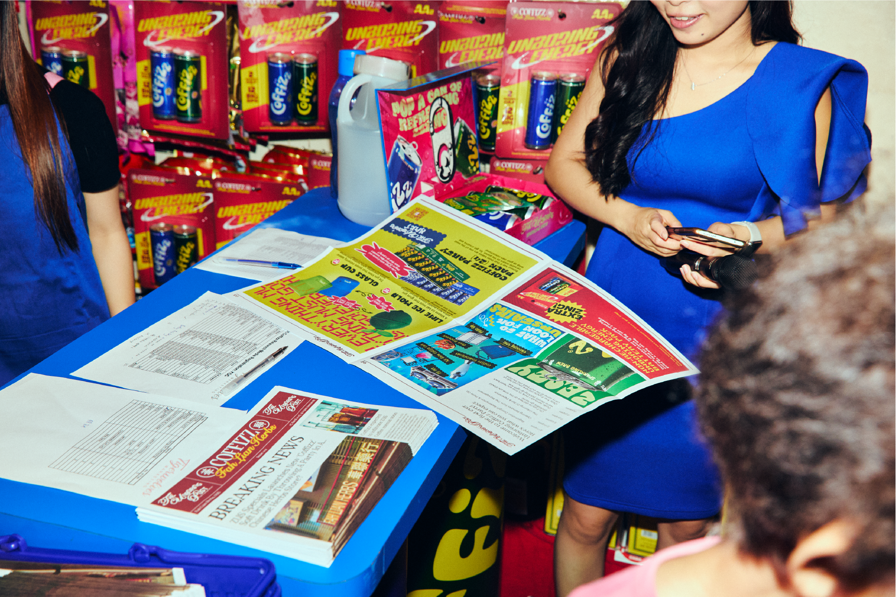
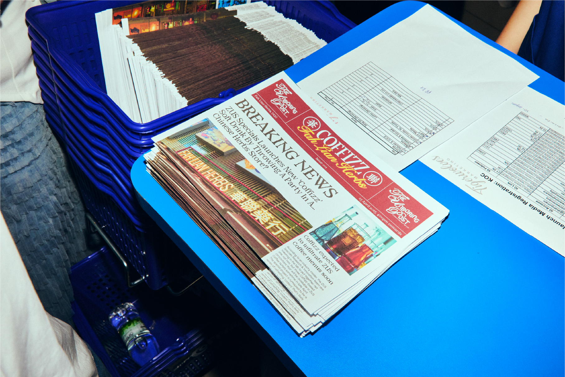
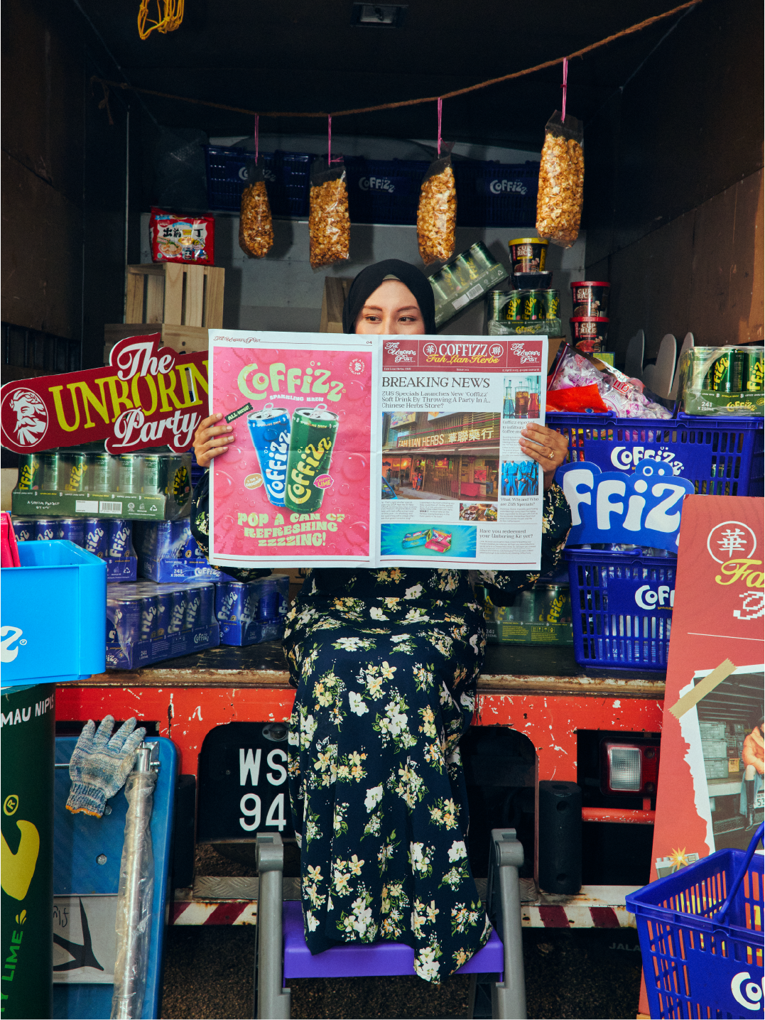
Transformed the official launch party itinerary into a vintage broadsheet newspaper, reimagining traditional print editorial with bold, high-saturation Coffizz visuals. Moving away from predictable event schedules, the custom publication featured "Breaking News" style headlines, event timelines, and brand storytelling rendered through retro typographic layouts.
Functioning as both a practical event guide and an atmospheric prop, the newspapers were styled across venue displays, registration counters, and beverage fridges. This tactile print touchpoint deepened the venue's immersion, giving guests an authentic, nostalgic souvenir that added an unexpected editorial layer to the launch experience.
COLD & REFRESHING,
ON DISPLAY.
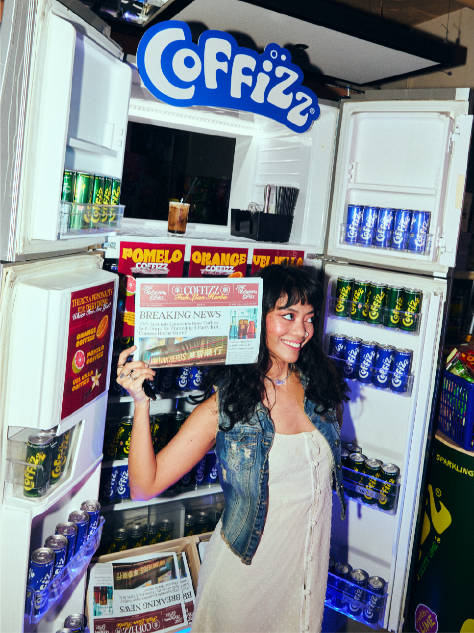
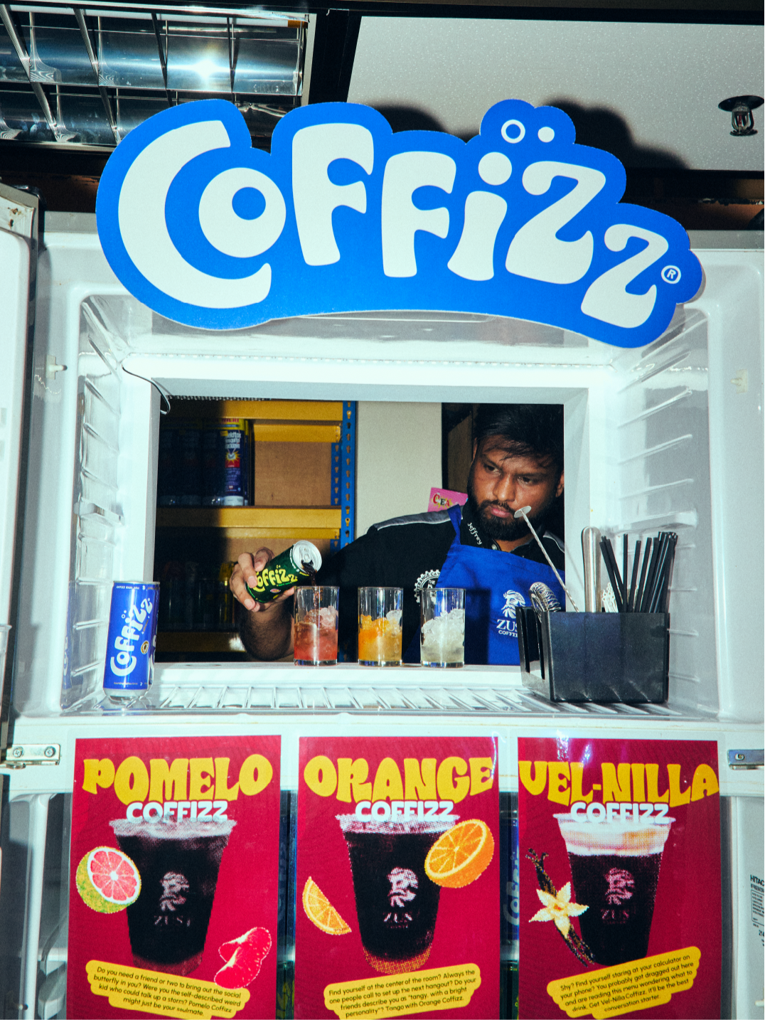
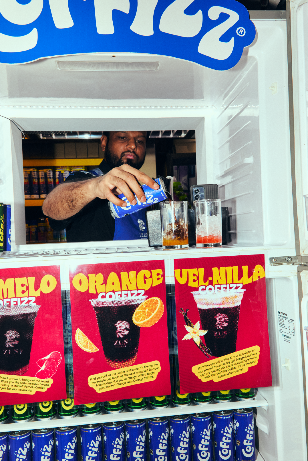
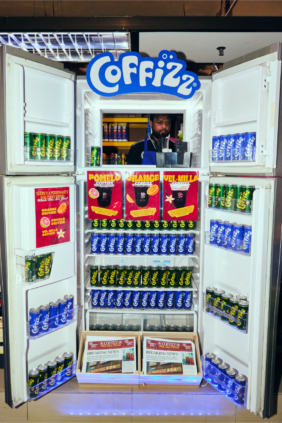
Designed a dual-purpose spatial installation centered around a fully operational, custom-branded commercial fridge setup. Operating as both a functional drink mixer station and an interactive photo-op area, the installation allowed guests to grab chilled Coffizz cans to mix signature drinks on the spot, seamlessly blending live event utility with hands-on guest engagement.
Art-directed the internal visual merchandising of the fridge to highlight the beverage's cold, effervescent appeal. Stocked with hyper-symmetrical rows of flavor-coded cans, the display integrated custom pop-art recipe cards on the door panels, subtle ambient lighting, and wooden crates holding the broadsheet event itineraries. The resulting setup created a high-contrast, photogenic focal point that drove organic content creation while showcasing Coffizz as the ultimate chilled refreshment.
a SCALED ROLLING WORLD of coffizz.
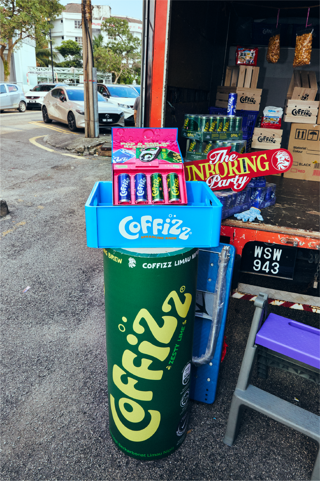
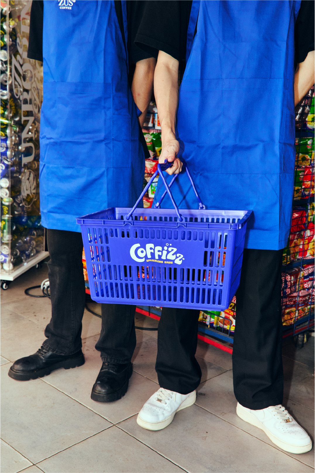
Conceptualized and art-directed a full-scale spatial activation, dressing a vintage delivery lorry to recreate the nostalgic charm of a traditional local sundry shop. Curated authentic retro props, including classic delivery crates, plastic shopping baskets, and weathered hardware, paired seamlessly alongside oversized, custom-built Coffizz display cans. Every element was engineered and scaled to bridge old-school neighborhood nostalgia with bold, modern brand energy.
Functioning as a high-impact interactive photo-op, the installation anchored the physical event space and invited guests to step directly into the narrative. By pairing tactile, lived-in vintage aesthetics with vibrant branded touchpoints, the setup created an authentic backdrop that encouraged organic social sharing and brought the campaign's street-level energy to life.
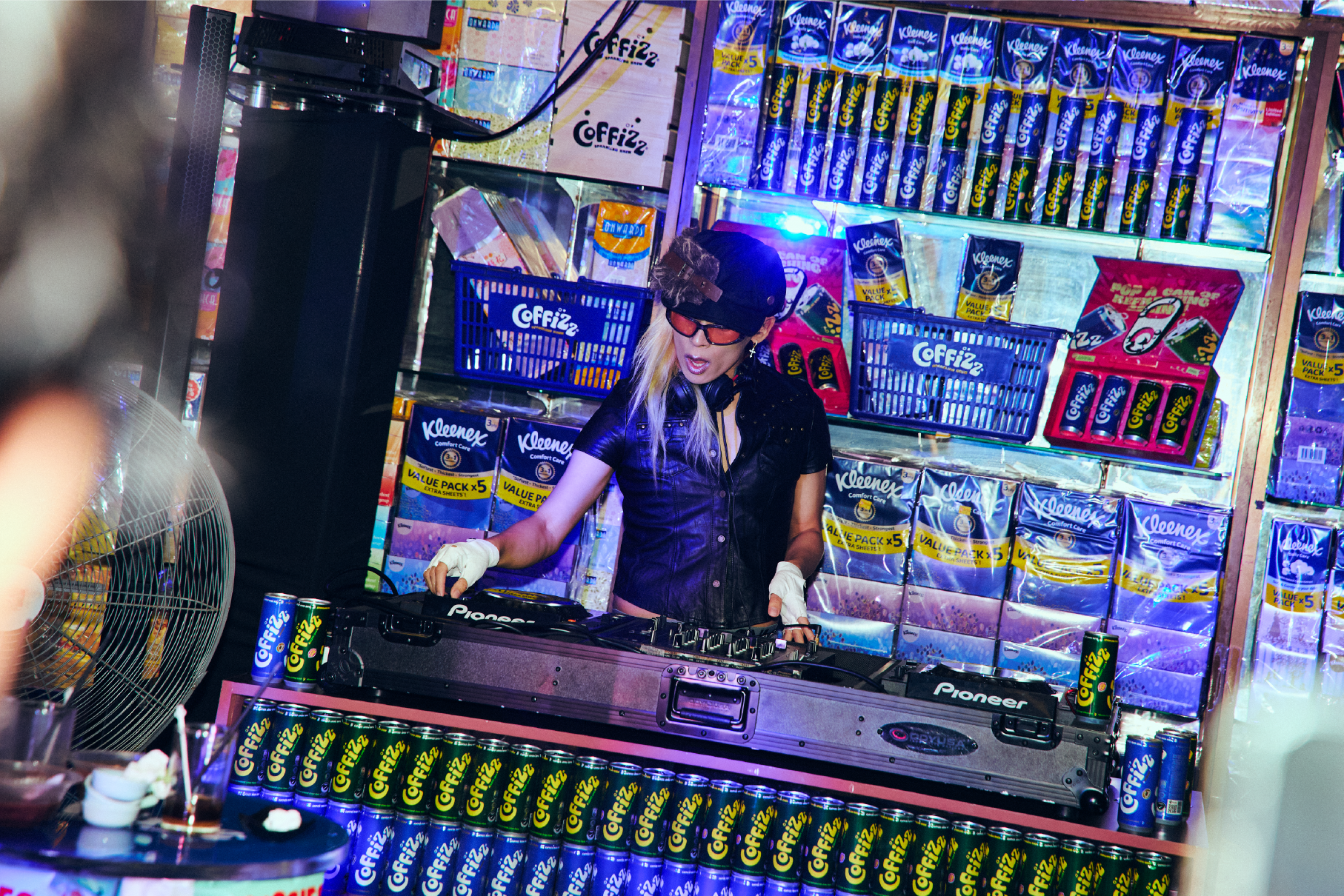
PERSCRIPTIONs OF A GOOD TIME
Transforming the main performance stage, the DJ booth was art-directed and built to mimic an authentic medicine cabinet and apothecary display shelf. Densely stocked with uniform rows of Coffizz cans alongside retro household essentials, the spatial setup playfully framed the beverage as the ultimate ‘prescription’ for an energetic night out.
By blending traditional remedy shop visual cues with modern club staging, the installation created an eye-catching focal point for the venue's headlining DJ sets. The custom stage backdrop seamlessly integrated product placement into the event's atmosphere, reinforcing the brand's irreverent, subcultural identity through immersive environmental design.
A cohesive brand world built to feel fizzy & refreshing.